In the spring of 2012, WordPress rolled out version 3.4. Alongside features like the Theme Customizer and seamless Tweet embeds, this update introduced a handy function for developers: the ability to detect whether a visitor was accessing a site using a mobile device such as a smartphone or tablet.
This function, wp_is_mobile(), arrived around the same time as Apple’s iPhone 4 “Retina Display,” which then boasted a resolution of 640 x 960 pixels. Fast forward just a few months to the iPhone 5, the screen size bumped up to 640 x 1,136 pixels. These screens, considered advanced at the time, look modest compared to current smartphones and tablets that blur distinctions between mobile and desktop display capabilities.
So, is wp_is_mobile() still beneficial today?
Table of Contents
The purpose of the wp_is_mobile() function
Back in 2012, widespread browser support for CSS media queries and truly responsive web design was in its infancy—especially among users of older browsers. However, the intent behind wp_is_mobile() wasn’t to make layout adjustments based on viewport size.
This function doesn’t differentiate between phones and tablets, nor does it consider the actual screen resolution or size. Rather, wp_is_mobile() was designed as a way for developers to help save bandwidth when serving content to mobile devices—devices that were often less powerful and used on tighter data plans than what we see today.
Though today’s mobile devices are as powerful, if not more so, than many desktops from that era, there are still circumstances where it’s useful to quickly determine if a visitor is using a mobile device versus a non-mobile device.
The wp_is_mobile() function in action
The wp_is_mobile() function in WordPress returns true when a visit comes from browsers on most smartphones and tablets (including popular e-readers like Kindle). A typical example of using this function to deliver different content in PHP might look like this:
<?php if( wp_is_mobile()){ ?>

    <p>This content is for mobile devices</p>

<?php } else { ?>

    <p>This content is for desktops (and laptops).</p>

<?php } ?>
If you find yourself needing to streamline your site’s output for mobile users—perhaps to conserve bandwidth—this approach can be used in theme files to produce distinct versions for mobile and desktop visitors.
Device detection for granular content adjustments
While CSS media queries and other responsive design techniques are fantastic for adjusting layout and presentation across devices, they don’t reveal how your users are actually interacting with your site.
For instance, desktop users are likely clicking with a mouse, while mobile users tap with their finger. Common instructions such as “right-click” don’t translate directly to touchscreens, where users may need to “press and hold” instead. This can impact how you communicate in help documentation or tooltips, as your terminology may not always fit the visitor’s context.
By combining wp_is_mobile() with WordPress shortcodes, you can offer editors handy tools to display context-appropriate instructions or information right inside their posts or pages.
Here’s how you can do it: Add this code to your theme’s functions.php file, ideally within a child theme to keep your changes upgrade-safe:
/**
 * Add shortcodes
 */

// Create [desktop] shortcode
add_shortcode('desktop', 'show_desktop_content');
function show_desktop_content($atts, $content = null){
    if( !wp_is_mobile() ){
        return do_shortcode( $content );
    } else {
        return null;
    }
}

// Create [mobile] shortcode
add_shortcode('mobile', 'show_mobile_content');
function show_mobile_content($atts, $content = null){
    if( wp_is_mobile() ){
        return do_shortcode( $content );
    } else {
        return null;
    }
}
This sets up [desktop] and [mobile] shortcodes (with their respective closing tags), letting you display device-specific content directly within posts or pages, like so:
<h2>Password Help</h2>

To change your password, [desktop]click[/desktop][mobile]tap[/mobile] the cog icon.
On a mobile device, visitors will see:

Visitors on other devices will see this:

This approach offers a straightforward way to ensure your content adapts based on how your audience interacts with your site.
The wp_is_mobile() function and WordPress caching
It’s widely known that page caching remains one of the top ways to boost WordPress site speed. However, standard caching setups can complicate delivering personalized content, especially when using wp_is_mobile() for device-specific variations.
A page is typically cached when first requested. If a mobile device triggers the initial cache, the page will be served in its mobile-optimized form to everyone, regardless of the device they’re actually using—until the cache refreshes.
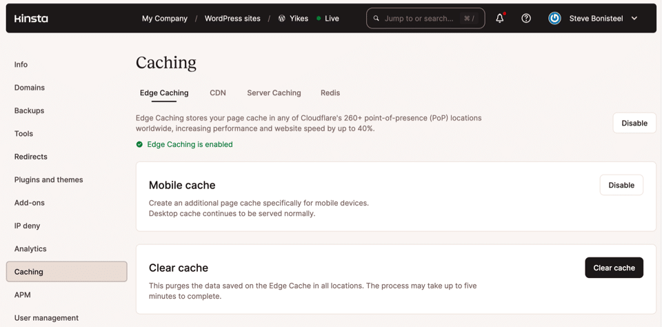
The solution is to set up separate caches for mobile and desktop content, so visitors get a version tailored to their device, regardless of who made the first request. This may require extra steps or configuration depending on your web hosting environment and caching plugins.
Some hosting platforms make it easy to manage mobile-specific caching settings from within their own dashboards:

Limitations and Considerations of wp_is_mobile()
While wp_is_mobile() is convenient, it’s important to understand some of its limitations. The function determines if a visitor is using a mobile device based solely on their user agent string. As a result, it may not always provide perfectly accurate detection. For example, certain browsers or devices may use non-standard user agent strings, or a desktop browser set to “mobile mode” could trigger a false positive. Conversely, some tablets running desktop-class browsers or ultra-compact laptops might not be recognized as mobile.
For highly specific use cases—such as differentiating between Android and iOS devices, or distinguishing between phones and tablets—developers often turn to more sophisticated libraries like Mobile Detect. This PHP library parses user agent strings in greater detail and offers finer-grained device classification.
Best Practices for Device Adaptation
- Prioritize Responsive Design: Modern CSS frameworks (such as Bootstrap or Tailwind CSS) and native media queries remain the gold standard for responsive layouts. Device detection via PHP should supplement, not replace, these techniques where truly required.
- Test Thoroughly: Because device detection is imperfect, always test your implementation across a variety of phones, tablets, and desktop devices. Emulators can help, but nothing matches real-device testing for user experience.
- Use Device Detection Sparingly: Wherever possible, favor strategies that degrade gracefully for unexpected user agent strings. For example, if device-specific instructions aren’t feasible, consider more generic terms: “Tap or click” instead of “Click”.
Expanding Device-Aware Functionality
Beyond simply displaying different content or instructions, wp_is_mobile() can help enhance mobile experiences in a number of practical ways:
- Conditional Loading: Only enqueue certain scripts or stylesheets for mobile users to optimize load times and reduce data usage.
- Navigation Adjustments: Offer simplified menu structures or larger touch targets when a visitor is on a mobile device.
- Advertising and Popups: Display different advertising formats or sizes based on device, or suppress potentially intrusive popups for mobile visitors in favor of less disruptive alternatives.
- Feature Toggles: Disable resource-intensive features like background video or complex animations for mobile users, where such elements may not render smoothly.
Sample Use Cases
- Mobile-friendly Call-to-Action: Show a prominent “Call Now” button on mobile, but an email link on desktop.
- Mobile-specific Banner: Offer an app download banner only to mobile users accessing your site.
- Bandwidth Conservation: Serve compressed or lower-resolution images to mobile devices while offering retina-quality images to desktops and tablets.
Alternatives and Future Trends
As web standards evolve, client-side solutions are gaining popularity for even greater accuracy and flexibility. The JavaScript window.matchMedia() API allows you to query the current display’s capabilities and adapt on the fly—something you can use in tandem with PHP-based detection for seamless progressive enhancement.
Meanwhile, as privacy concerns grow, operating systems and browsers are increasingly giving users ways to mask or spoof device identifiers. Designing graceful, fallback-ready experiences remains crucial as no detection method will remain foolproof forever.
Conclusion
In summary, wp_is_mobile() is a helpful legacy tool for WordPress developers seeking to refine the mobile experience or offer basic device-aware content. However, it should be used judiciously and in the context of today’s responsive, privacy-conscious, and performance-oriented web. Combining PHP-based detection with modern front-end techniques ensures your site remains fast, accessible, and user-friendly for everyone—regardless of which device they choose.


