Since web fonts became available in 2009, web designers have had significantly broader typographic choices. This freedom largely comes from the flexibility of the CSS @fontface at-rule, which allows for alternative font selections beyond just web-safe, system-default fonts. Also take a look at this related read → Top Google Fonts for your website
There’s a wide selection of font file formats, many distributed by large foundries and services—Google Fonts is a prime example.
Earlier, using web fonts typically meant managing different files for each font weight and style. The file naming conventions made it straightforward to identify how any individual font would appear on your site, for example:
Roboto-Italic.woff2
Lato-BoldItalic.woff2
OpenSans-SemiBold.ttf
WorkSans-ExtraBold.ttf
Each font variant had to be loaded as a separate file. This increased the total download size and number of HTTP requests, making typography management and performance optimization more challenging.
Table of Contents
The rise of variable fonts
In 2016, digital typography saw a groundbreaking development: variable fonts. Created through collaboration between Google, Apple, Adobe, and Microsoft, variable fonts soon gained mainstream adoption.
The major advantage of a variable font is that it can encapsulate several axes of typographic variation, known as “axes,” within a single file:
| Axis | CSS Property |
| weight | font-weight |
| style | font-style: italic |
| slant | font-style: oblique |
| stretch | font-stretch |
| Optical Size axis (opsz) | font-variations-setting |
The most common and efficient format for variable fonts is .woff2 (Web Open Font Format), which achieved W3C Recommendation status in 2018. While .ttf and .otf formats can also serve as variable fonts, .woff2 is preferred for its compression. Today, all current browsers support variable fonts.
As we discuss “web fonts” and “variable fonts,” keep in mind that the two are closely related, though they’re sometimes used interchangeably in the industry.
Why use variable fonts?
Variable fonts bring several key benefits to your web projects:
- Improved Performance: With a single variable font file covering all your weights and styles, you’ll cut down on both the number of HTTP requests and the total file size, helping your site load faster.
- Greater Design Freedom: You gain precise control over font attributes. For example, rather than being limited to pre-set weights like
500or600, you can use exact custom values like532for nuanced style adjustments. - Responsive Typography: Because variable fonts offer smooth, continuous axes, you can create typography that scales elegantly across different devices; for instance, using
font-weight: clamp()for seamless adjustment between viewport sizes.
How WordPress uses variable fonts
As of WordPress 6.1, released in November 2022, the theme.json system gained full support for variable fonts. The Twenty Twenty-Three theme was among the first to showcase this functionality.
Customizing a theme with variable fonts
When developing with a child theme based on TT5, the best practice is to enqueue both parent and child theme styles.
To keep your custom fonts consistent in both the WordPress editor and on your site’s front end, enqueue a fonts.css file containing the relevant @font-face rules.
<?php
// enqueue parent and child styles
add_action('wp_enqueue_scripts', function() {
   wp_enqueue_style(
       'parent-style',
       get_template_directory_uri() . '/style.css'
   );

   wp_enqueue_style(
       'child-style',
       get_stylesheet_uri(),
       array('parent-style'),
       wp_get_theme()->get('Version')
   );

   // enqueue custom fonts
   wp_enqueue_style(
       'child-fonts',
       get_stylesheet_directory_uri() . '/fonts.css',
       array(),
       wp_get_theme()->get('Version')
   );
});
Remember, the specifics of how you enqueue scripts can vary by theme, and there’s no one-size-fits-all solution.
To confirm your child theme setup, try this check in your styles.css:
body { background: #0000ff; }Adding fonts with theme.json
TT5 ships with two variable fonts: Manrope and Fira Code. For this walkthrough, let’s add Vollkorn and set it as the default heading font at a weight of 600.
Here’s how part of your theme.json might look:
{
  "$schema": "https://schemas.wp.org/wp/6.7/theme.json",
  "version": 3,
  "settings": {
    "appearanceTools": true,
    "typography": {
      "fontFamilies": [
        {
          "name": "Manrope",
          "slug": "manrope",
          "fontFamily": "Manrope, sans-serif",
          "fontFace": [
            {
              "fontFamily": "Manrope",
              "src": ["file:../twentytwentyfive/assets/fonts/manrope/Manrope-VariableFont_wght.woff2"],
              "fontWeight": "200 800",
              "fontStyle": "normal"
            }
          ]
        },
        {
          "name": "Fira Code",
          "slug": "fira-code",
          "fontFamily": ""Fira Code", monospace",
          "fontFace": [
            {
              "fontFamily": ""Fira Code"",
              "src": ["file:../twentytwentyfive/assets/fonts/fira-code/FiraCode-VariableFont_wght.woff2"],
              "fontWeight": "300 700",
              "fontStyle": "normal"
            }
          ]
        },
        {
          "name": "Vollkorn",
          "slug": "vollkorn",
          "fontFamily": "Vollkorn, serif",
          "fontFace": [
            {
              "fontFamily": "Vollkorn",
              "src": ["file:../twentytwentyfive/assets/fonts/vollkorn/Vollkorn-VariableFont_wght.woff2"],
              "fontWeight": "400 900",
              "fontStyle": "normal"
            },
            {
              "fontFamily": "Vollkorn",
              "src": ["file:../twentytwentyfive/assets/fonts/vollkorn/Vollkorn-Italic-VariableFont_wght.woff2"],
              "fontWeight": "400 900",
              "fontStyle": "italic"
            }
          ]
        }
      ],
      "customFontSize": true,
      "fluid": true
    }
  },
  "styles": {
    "typography": {
      "fontFamily": "var:preset|font-family|manrope"
    },
    "elements": {
      "heading": {
        "typography": {
          "fontFamily": "var:preset|font-family|vollkorn",
          "fontWeight": "600"
        }
      }
    }
  }
}
With this configuration, the Vollkorn font will be used for headings across your site.
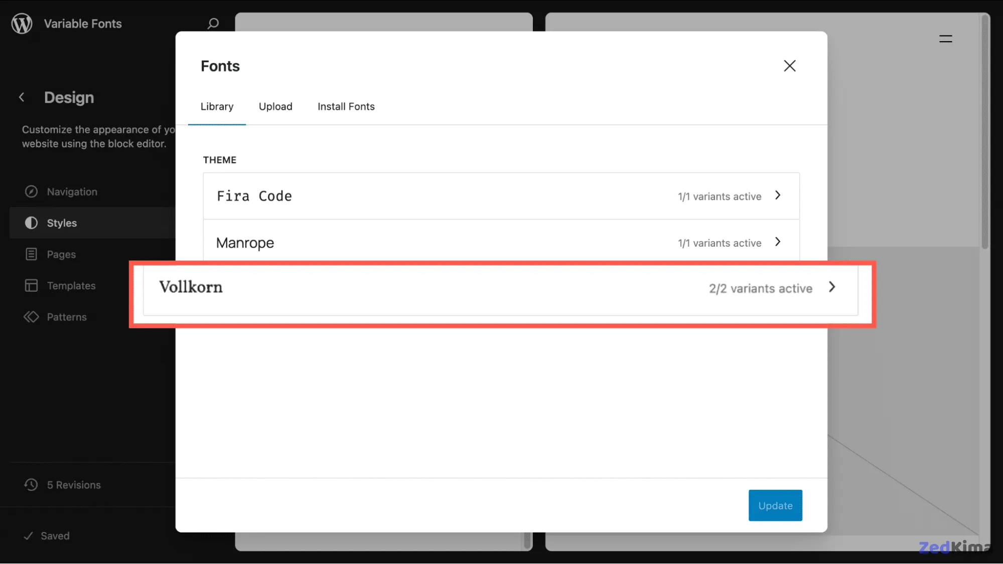
Keep the following in mind:
- If the parent theme updates file paths or makes other changes, you might want to copy the Manrope and Fira Code files to your child theme.
- It may seem redundant to redeclare fonts registered in the parent, but doing so in your child theme is important. This keeps them visible and functional in the Font Library UI and guards against lost references if the parent theme changes.
- In this case, we’re pointing to two separate Vollkorn files.
Ensuring fonts load correctly
Sometimes, fonts won’t render as expected on your site until explicitly declared in your CSS. An example snippet from styles.css would look like this:
/*
Theme Name: TT5 Child
Template: twentytwentyfive
Version: 1.0
*/

/* Ensure fonts are loaded and applied */
body {
  font-family: 'Manrope', -apple-system, BlinkMacSystemFont, 'Segoe UI', Roboto,
               Oxygen-Sans, Ubuntu, Cantarell, sans-serif;
}

code,
pre {
  font-family: 'Fira Code', 'Courier New', monospace;
}

h1,
h2,
h3,
h4,
h5,
h6 {
  font-family: 'Vollkorn', 'Times New Roman', serif;
}
Then, in fonts.css, declare your font files with @font-face. This tells browsers exactly which font files to fetch. For optimal performance—especially for critical fonts—consider preloading them with a <link rel="preload"> in your site’s <head>, using WordPress hooks. Generally, @font-face with font-display: swap strikes a strong balance between speed and user experience.
/* Preload critical fonts for better performance */
@font-face {
  font-family: 'Manrope';
  src: url('../twentytwentyfive/assets/fonts/manrope/Manrope-VariableFont_wght.woff2')
       format('woff2');
  font-weight: 100 900;
  font-style: normal;
  font-display: swap;
}

@font-face {
  font-family: 'Fira Code';
  src: url('../twentytwentyfive/assets/fonts/fira-code/FiraCode-VariableFont_wght.woff2')
       format('woff2');
  font-weight: 100 900;
  font-style: normal;
  font-display: swap;
}

@font-face {
  font-family: 'Vollkorn';
  src: url('../twentytwentyfive/assets/fonts/vollkorn/Vollkorn-VariableFont_wght.woff2')
       format('woff2');
  font-weight: 100 900;
  font-style: normal;
  font-display: swap;
}

@font-face {
  font-family: 'Vollkorn';
  src: url('../twentytwentyfive/assets/fonts/vollkorn/Vollkorn-Italic-VariableFont_wght.woff2')
       format('woff2');
  font-weight: 100 900;
  font-style: italic;
  font-display: swap;
}
This approach ensures headings default to Vollkorn at weight 600 across your site.
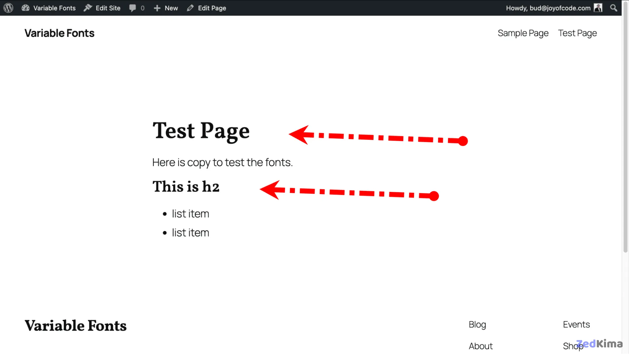
If preferred, you can move the @font-face rules directly into styles.css, which can eliminate the need for a separate fonts.css.
Making it easy for users to choose font weights
One significant benefit of variable fonts is the flexibility of their weight axis—you’re no longer limited to specific steps like 400 or 700. Instead, any value within the 100–900 range is at your disposal. However, WordPress doesn’t yet offer a user interface for selecting custom weights out of the box.
To help address this, we’ve developed a simple plugin called Font Weight Options. This plugin creates an option page under Appearance > Font Weight, letting you set custom weights for body, headings, and code fonts.
Here’s a streamlined version of the core logic:
<?php
/**
 * Plugin Name: Font Weight Options
 */

class Font_Weight_Options {
    public function __construct() {
        add_action( 'admin_menu', array( $this, 'add_admin_menu' ) );
        add_action( 'wp_head', array( $this, 'apply_font_weights_frontend' ) );
    }

    public function add_admin_menu() {
        add_theme_page(
            __( 'Font Weight Settings', 'font-weight-options' ),
            __( 'Font Weight', 'font-weight-options' ),
            'manage_options',
            'font-weight-settings',
            array( $this, 'render_admin_page' )
        );
    }

    public function apply_font_weights_frontend() {
        $weights = get_option( 'fwo_font_weights', array(
            'body' => 400,
            'headings' => 600,
            'code' => 400,
        ) );

        echo "<style>
            body { font-weight: {$weights['body']} !important; }
            h1, h2, h3, h4, h5, h6 { font-weight: {$weights['headings']} !important; }
            code, pre { font-weight: {$weights['code']} !important; }
        </style>";
    }
}

new Font_Weight_Options();
You can view the full plugin source code on GitHub Gist for the complete solution, including the settings interface and validation features.
The full-featured version includes:
- Default settings upon activation
- Simple administrator form with numeric fields (covering the 100–900 range)
- Validation to guarantee values stay within bounds
- Font weight output for both the block editor and your live site
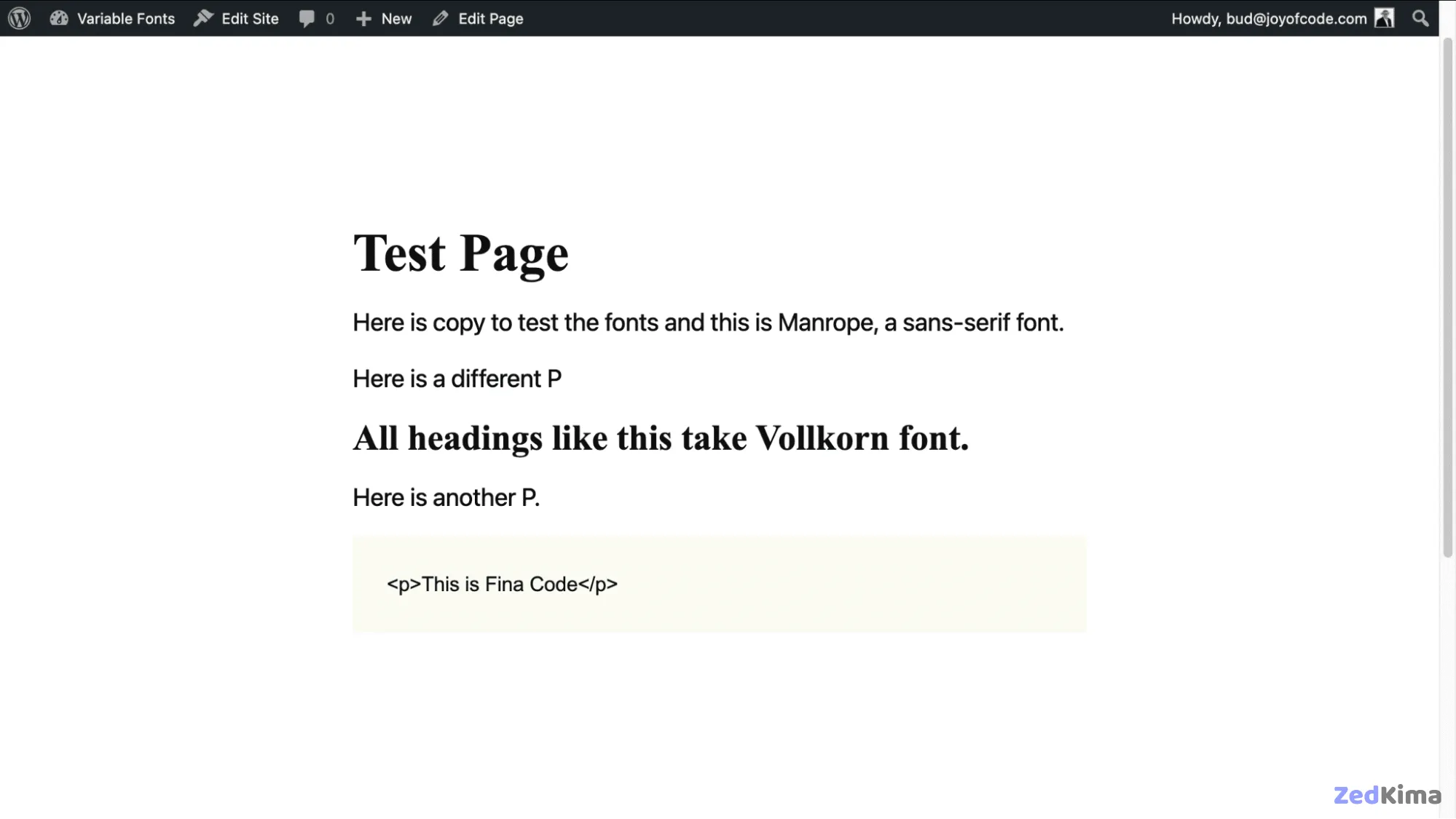
The result is a new admin page for defining font weight values for your selected fonts, using any values you choose—even if they’re not typical preset weights.
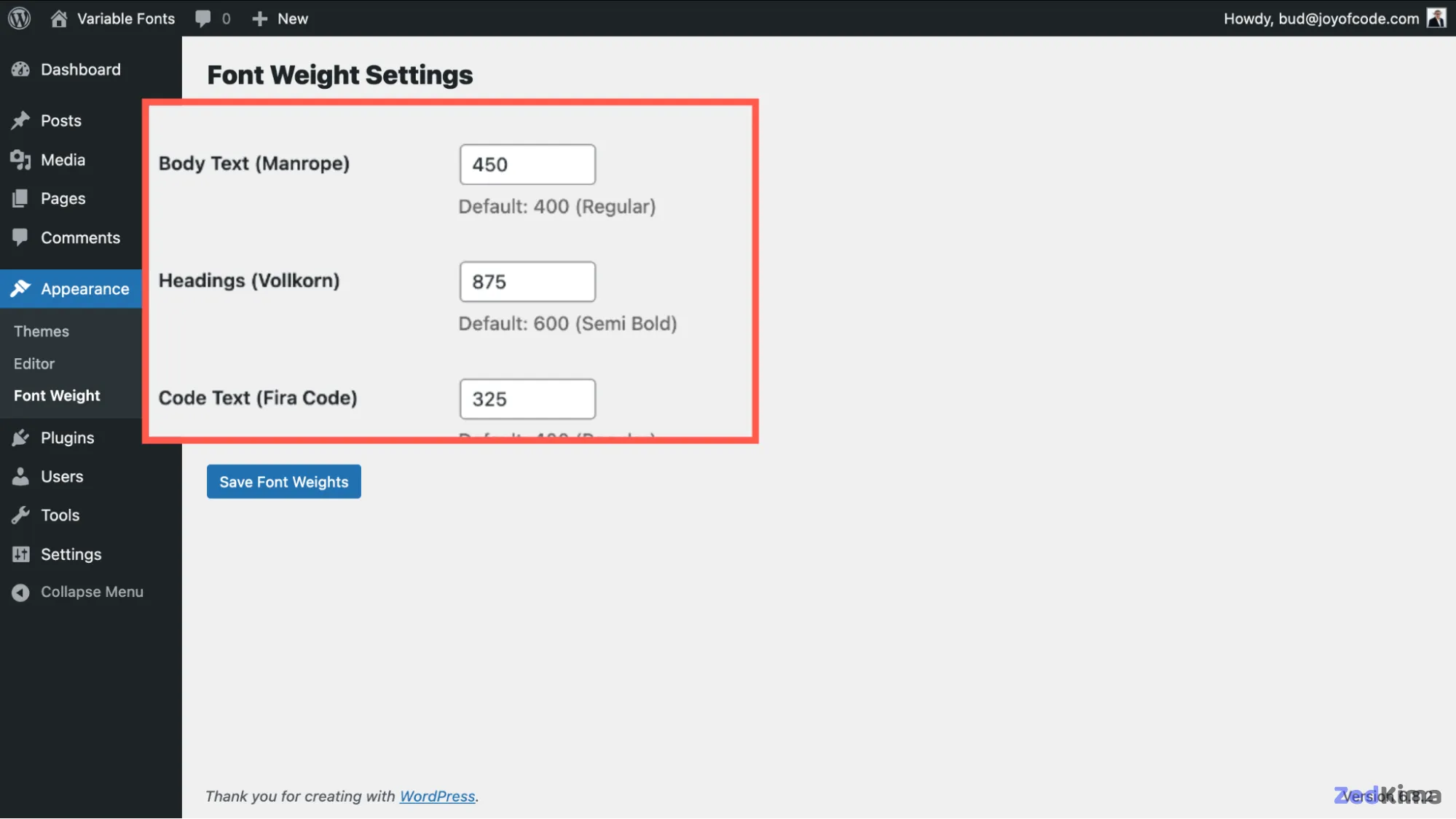
This leads to a site displaying each chosen font with its assigned custom weight, correctly shown both in the editor and the front end.
A kinder, simpler way to add a single variable font
If all of the above seems too involved, there’s a quicker alternative for bringing a variable font into your theme—even if it’s a little less full-featured.
Google Fonts can be added directly using the Font Library. For guidance, be sure to check out resources on selecting and using Google Fonts effectively.
But if you have a font in mind that isn’t available on Google Fonts, many open-source and properly licensed fonts are available elsewhere. In this example, we grabbed SourceSans3VF-Upright, an Adobe font from GitHub.
The process is to place your desired font file in your child theme’s /assets/fonts folder. Then, set up functions.php as follows:
<?php
/**
 * Enqueue parent and child theme styles.
 */
function twentytwentyfive_kinstachild_enqueue_styles() {
    // Parent theme style.
    wp_enqueue_style(
        'twentytwentyfive-style',
        get_parent_theme_file_uri( 'style.css' ),
        array(),
        wp_get_theme()->get( 'Version' )
    );

    // Child theme style.
    wp_enqueue_style(
        'twentytwentyfive-child-style',
        get_stylesheet_uri(),
        array( 'twentytwentyfive-style' ),
        wp_get_theme()->get( 'Version' )
    );
}
add_action( 'wp_enqueue_scripts', 'twentytwentyfive_kinstachild_enqueue_styles' );

/**
 * Enqueue child theme styles in the editor.
 */
add_action( 'after_setup_theme', function() {
    add_editor_style( 'style.css' );
} );
As in earlier steps, make sure your theme.json brings in Manrope and Fira Code from the parent; leaving these out will drop them from your theme.
{
  "$schema": "https://schemas.wp.org/wp/6.7/theme.json",
  "version": 3,
  "settings": {
    "typography": {
      "fontFamilies": [
        {
          "name": "Manrope",
          "slug": "manrope",
          "fontFamily": "Manrope, sans-serif",
          "fontFace": [
            {
              "src": [
                "file:../twentytwentyfive/assets/fonts/manrope/Manrope-VariableFont_wght.woff2"
              ],
              "fontWeight": "100 900",
              "fontStyle": "normal",
              "fontFamily": "Manrope"
            }
          ]
        },
        {
          "name": "Fira Code",
          "slug": "fira-code",
          "fontFamily": ""Fira Code", monospace",
          "fontFace": [
            {
              "src": [
                "file:../twentytwentyfive/assets/fonts/fira-code/FiraCode-VariableFont_wght.woff2"
              ],
              "fontWeight": "100 900",
              "fontStyle": "normal",
              "fontFamily": ""Fira Code""
            }
          ]
        },
        {
          "name": "Source Sans 3",
          "slug": "source-sans-3",
          "fontFamily": ""Source Sans 3", sans-serif",
          "fontFace": [
            {
              "src": [
                "file:./assets/fonts/SourceSans3VF-Upright.woff2"
              ],
              "fontWeight": "100 900",
              "fontStyle": "normal",
              "fontFamily": "Source Sans 3"
            }
          ]
        }
      ]
    }
  }
}
And don’t forget a basic styles.css file—it’s required to ensure WordPress recognizes your child theme.
Summary
Whether you opt for a fully customized setup or just want a quick method for variable font integration, WordPress now makes it possible to refine your site’s typography with ease. Variable fonts provide performance improvements, reduce complexity, and unlock responsive, flexible design possibilities that standard static fonts can’t offer.
To take full advantage of variable fonts, consider developing a user interface that brings their adjustable axes (like weight or slant) to your users for greater typographic control.
Thoughtful planning and the right tools will let you implement advanced, modern typography on your WordPress site efficiently—enhancing your users’ experience and your site’s performance.
Understanding web font formats and their implications
When selecting font formats for your web project, understanding their differences is crucial for optimizing load times and browser compatibility. Here is a quick overview:
- .woff/.woff2: The most recommended formats for the web.
.woff2offers best-in-class compression, making it ideal for performance. These are widely supported across major browsers. - .ttf (TrueType Font): Known for high compatibility, especially with legacy systems, but less optimized for the web due to larger file sizes.
- .otf (OpenType Font): Allows advanced typographic features and is interchangeable with
.ttfin many scenarios. However, it is not as space-efficient as.woff2. - .eot (Embedded OpenType): Developed for Internet Explorer, now rarely needed.
For most projects, .woff2 should be prioritized. Some developers include fallbacks for older browsers with a @font-face stack referencing multiple formats:
@font-face {
  font-family: 'MyFont';
  src: url('myfont.woff2') format('woff2'),
       url('myfont.woff') format('woff'),
       url('myfont.ttf') format('truetype');
  font-display: swap;
}
Advanced variable font axes and creative opportunities
Beyond the commonly used axes like weight and slant, many modern variable fonts incorporate additional creative axes. Here are some examples:
- Grade (GRAD): Allows fine-tuning contrast without affecting letter proportions, ideal for balancing display and text readability in various lighting conditions.
- Width (wdth): Lets you stretch or condense glyphs for responsive layouts, without needing separate “condensed” or “expanded” font files.
- Italic angle (ital): Enables you to set a custom italic slant or interpolation between roman and italic forms.
- Custom axes: Some highly flexible fonts expose axes for things like terminal shape, serif size, or even playful transformations. For example, the Roslindale Variable Font demo lets you adjust optical size, weight, and width simultaneously.
These axes open doors to micro-adjustments in branding, accessibility, and scalable user interfaces. CSS for custom axes might look like this:
font-variation-settings: 'wght' 540, 'wdth' 82, 'GRAD' 60;
Performance and user experience improvements
Variable fonts align closely with modern web performance best practices:
- Reducing HTTP requests by combining styles and weights in a single file minimizes round-trips between browser and server.
- Improved First Contentful Paint (FCP) and Largest Contentful Paint (LCP), metrics critical to SEO and user perception of speed.
- Using
font-display: swap;helps prevent invisible text while waiting for font downloads—a common usability complaint.
Lighthouse audits and other performance tools often highlight inefficient font delivery. Variable fonts simplify audit troubleshooting and optimize Core Web Vitals, giving your users a better experience and potentially improving your search ranking.
Progressive enhancement
If you anticipate users on older devices or browsers, you can include fallback font families and static fonts to ensure graceful degradation. Here’s a sample @font-face set-up: This is worth a look as well → Scaling typeface gracefully with fluid typography CSS
@font-face {
  font-family: 'CustomVariable';
  src: url('custom-variable.woff2') format('woff2-variations');
  font-weight: 100 900;
  font-display: swap;
}
@font-face {
  font-family: 'CustomVariable';
  src: url('custom-static-700.woff2') format('woff2');
  font-weight: 700;
  font-display: swap;
}
Testing font performance and appearance
After integrating a new variable font, always conduct cross-browser and cross-platform testing. Useful tools and tips include:
- Modern Font Stacks for reliable CSS fallbacks.
- Browser DevTools: Inspect how fonts load, render, and fall back based on your CSS.
- Google Fonts Knowledge for guidance and case studies.
- Automated performance tools: Lighthouse, WebPageTest, or GTmetrix to quantify improvement in load times and font rendering stability.
Accessibility considerations for advanced typography
While variable fonts enhance flexibility and brand alignment, always keep accessibility in mind:
- Ensure adequate contrast ratios between text and backgrounds as some axes (like Grade or Weight) can unintentionally diminish legibility, especially for users with visual impairments.
- Allow users to override styles with browser or OS settings, and avoid locking typography to extremes of any axis.
- Test zoom and scaling with assistive technologies—variable fonts need to behave predictably as users magnify content.
Best practices recap
- Prioritize
.woff2for modern browsers, supplement with fallbacks as needed. - Use
@font-facewith clearly defined axes and ranges to unlock the full potential of variable fonts. - Preload critical web fonts for improved perceived performance.
- Evaluate each font for accessibility, performance, and cross-browser support.
- Continuously monitor your site’s typographic rendering with future WordPress and browser updates, as support and best practices evolve.

