

Getting typography to look great on any screen is harder than it sounds. For years, web designers relied on media query breakpoints to resize text, but that method gets unwieldy fast as new devices and viewport sizes keep rolling out.
Starting with WordPress 6.1 (released in November 2022), there’s a cleaner approach: fluid typography. It smoothly scales the font sizes you define in your theme.json file so type adjusts gracefully, no matter the viewport’s width or height.
Beyond font size, the same technique can be applied to related properties—like line height and spacing—when you configure them to scale, giving you a more consistent, readable, and accessible experience across devices.
This article covers how fluid typography works, how it differs from breakpoint-based sizing, and how to set it up in WordPress using theme.json and CSS.
First, let’s revisit the old way of handling type, and why fluid sizing is such a meaningful upgrade.
Table of Contents
Breakpoint typography vs. fluid typography
A helpful way to grasp fluid typography is to compare it to breakpoint-based typography, which depends on media queries that target specific viewport widths for font sizing.
Breakpoint typography
Breakpoints typically define ranges of viewport widths in pixels. A common pattern is three breakpoints aimed at mobile, laptop, and desktop screens.
Here’s a typical set of breakpoints for laptops in a CSS file:
@media (min-width: 48em) and (max-width: 74.9375em) {
  body {
    font-size: 1.125rem;
    line-height: 1.6;
  }
  h1 {
    font-size: 2rem;
  }
}
This works, but it doesn’t scale well: as more devices and screen sizes appear, maintaining a growing stack of queries becomes difficult and error-prone.
In the GIF above, as the viewport narrows, type changes size in noticeable jumps. This “stepping” can feel awkward and unpredictable—far from the smooth, continuous scaling most designs need.
Fluid typography
With the arrival of the CSS clamp() function in 2019 and viewport units (vw and vh), seamless, automatic scaling became practical.
These features let you define text that responds to the viewport’s dimensions, greatly reducing or eliminating the need for multiple breakpoints.
Here’s an example of a medium font size using clamp():
.has-medium-font-size {
  font-size: clamp(1rem, 1rem + 0.5vw, 1.25rem);
}
We’ll unpack clamp() shortly, but think of it as a formula with a minimum, a preferred (fluid) value, and a maximum. It keeps type within sensible bounds while scaling smoothly.
In this GIF, as the viewport gets smaller, the text resizes fluidly—no sudden jumps.
That continuous, natural scaling is the big advantage over breakpoint-only approaches. Rather than resizing in steps, your type adjusts at a steady pace across screens.
And smooth resizing is only part of the story. Fluid typography also makes it easier to build flexible, consistent, and accessible interfaces.
The case for fluid typography
As you put fluid typography to work, these benefits stand out.
Responsive by default
Text automatically scales with the viewport, so you can rely less on breakpoints. Whether someone visits on a phone, tablet, or ultra-wide monitor, sizes adapt without extra CSS.
Easier to maintain
Fewer media queries mean cleaner stylesheets. Define a simple “T-shirt” type scale—small through extra-large—and reuse it consistently across your theme.
Consistent design
Keep font sizes unified throughout your site, globally or per block as needed. Set the scale once and it propagates across blocks, patterns, and templates.
Improved accessibility and readability
Because sizes change smoothly, text remains comfortably readable on different devices and with user zoom—helpful for accessibility and overall legibility.
Future-proof design
Since type isn’t tied to fixed breakpoints, your scale continues to work as new screen sizes and devices come along.
Control over scaling speed
You can fine-tune how quickly text grows or shrinks by adjusting the preferred value (the middle term in clamp()) that responds to viewport width.
Browser support
The clamp() function is supported in all modern browsers, including current versions of Chrome, Edge, Firefox, and Safari.
For full coverage, include fallbacks for older browsers (for example, Internet Explorer 11 and some pre-2020 Safari and Chrome releases).
Here’s how to do that:
/* Fallback (for IE11 and other old browsers) */
li {
  font-size: 1.25rem;
}

/* Preferred (modern browsers) */
li {
  font-size: clamp(1rem, 1rem + 0.5vw, 1.5rem);
}
How fluid typography works
Fluid typography relies on three values: a minimum, a maximum, and a preferred value that varies with viewport size. The preferred value tracks the viewport so the size transitions smoothly between the min and max.
The clamp() function expresses those values in a single rule:
font-size: clamp(min, preferred, max);This guarantees text won’t get too small on compact screens or too large on wide displays. For example:
font-size: clamp(1rem, 1rem + 0.5vw, 1.25rem);Here, the font starts at 1rem, scales up as the viewport expands, and stops growing at 1.25rem.
How WordPress handles it
WordPress takes care of the math. Instead of hand-calculating values, you define font sizes in theme.json.
Here’s a simplified example of how WordPress represents a font size in JSON:
{
  "fluid": {
    "min": "1rem",
    "max": "1.25rem"
  },
  "name": "Medium",
  "size": "1.125rem",
  "slug": "medium"
}
From that, WordPress generates the CSS for you:
font-size: clamp(1rem, 1rem + 0.5vw, 1.25rem);This makes fluid type quick to implement and consistent across your theme. Set your values once in theme.json, and WordPress handles the rest.
Common terms
Before moving on, here are a few key units used with fluid typography. Each scales relative to a reference.
| Unit | Definition | Notes |
| em | Relative to the computed font size of the parent element. | Sizes can compound through nesting. |
| rem | Relative to the root (html) element’s font size. | Provides consistent scaling site-wide. |
| vw | 1% of the viewport width. | Useful for width-based scaling. |
| vh | 1% of the viewport height. | Useful for height-based scaling. |
A few words about theme.json
theme.json is data-driven: you declare settings and styles, and WordPress outputs the CSS for you.
WordPress core ships with its own theme.json that establishes baseline values. A block theme’s theme.json builds on that, including how fluid typography is applied.
As with most style properties, you can override settings globally or per block—ideally in a child theme so updates are safe.
If you’re new to theme.json, we recommend reading “Working with properties and key-value pairs in theme.json.”
How WordPress uses fluid typography in TT5 (Twenty Twenty Five)
When a block theme’s theme.json includes "fluid": true, WordPress generates fluid typography using the CSS clamp() function. A built-in algorithm calculates values that scale smoothly between the minimum and maximum you provide.
{
  "settings": {
    "typography": {
      "fluid": true
    }
  }
}
If "fluid" is omitted, WordPress defaults to false, so sizes remain fixed rather than scaling fluidly.
With fluid typography enabled, TT5 defines five preset font sizes. Each includes minimum and maximum values that WordPress uses to generate the final CSS via clamp().
| Size Name | Theme.json values | Generated CSS clamp values |
| small | size:0.875rem | clamp(0.875rem, 0.8125rem + 0.2vw, 1rem) |
| medium | min:1rem max: 1.125rem | clamp(1rem, 0.9375rem + 0.25vw, 1.125rem) |
| large | min:1.125rem max: 1.375rem | clamp(1.125rem, 1.0625rem + 0.5vw, 1.375rem) |
| x-large | min:1.75rem max: 2rem | clamp(1.75rem, 1.5rem + 1vw, 2rem) |
| xx-large | min:2.15rem max: 3rem | clamp(2.15rem, 1.9rem + 2vw, 3rem) |
Practical examples
Now that we’ve seen how TT5 handles fluid type by default, let’s walk through a few real-world tweaks you might make.
For the following examples, we’ll use a TT5 child theme. As always, ensure your assets are enqueued correctly.
Increase all font sizes by 25%
If your audience benefits from larger text (for example, accessibility-focused or senior-friendly sites), you can scale up globally.
Option 1 — Using theme.json
There isn’t a single switch to scale everything at once, but you can raise each preset by 25%. Here’s one way to configure it:
"typography": {
  "fontSizes": [
    {
      "fluid": false,
      "name": "Small",
      "size": "1.09375rem",
      "slug": "small"
    },
    {
      "fluid": { "max": "1.40625rem", "min": "1.25rem" },
      "name": "Medium",
      "size": "1.25rem",
      "slug": "medium"
    },
    {
      "fluid": { "max": "1.71875rem", "min": "1.40625rem" },
      "name": "Large",
      "size": "1.725rem",
      "slug": "large"
    },
    {
      "fluid": { "max": "2.5rem", "min": "2.1875rem" },
      "name": "Extra Large",
      "size": "2.1875rem",
      "slug": "x-large"
    },
    {
      "fluid": { "max": "3.75rem", "min": "2.6875rem" },
      "name": "Extra Extra Large",
      "size": "2.6875rem",
      "slug": "xx-large"
    }
  ]
}
This follows TT5’s approach: the small size is fixed, while the larger sizes scale fluidly.
WordPress still calculates the preferred (fluid) values between each min and max for you.
Option 2 — Using style.css
Alternatively, bump everything up globally with one rule in your stylesheet:
:root {
  font-size: 125%;
}
This increases the root font size by 25%, which scales all elements that use rem units.
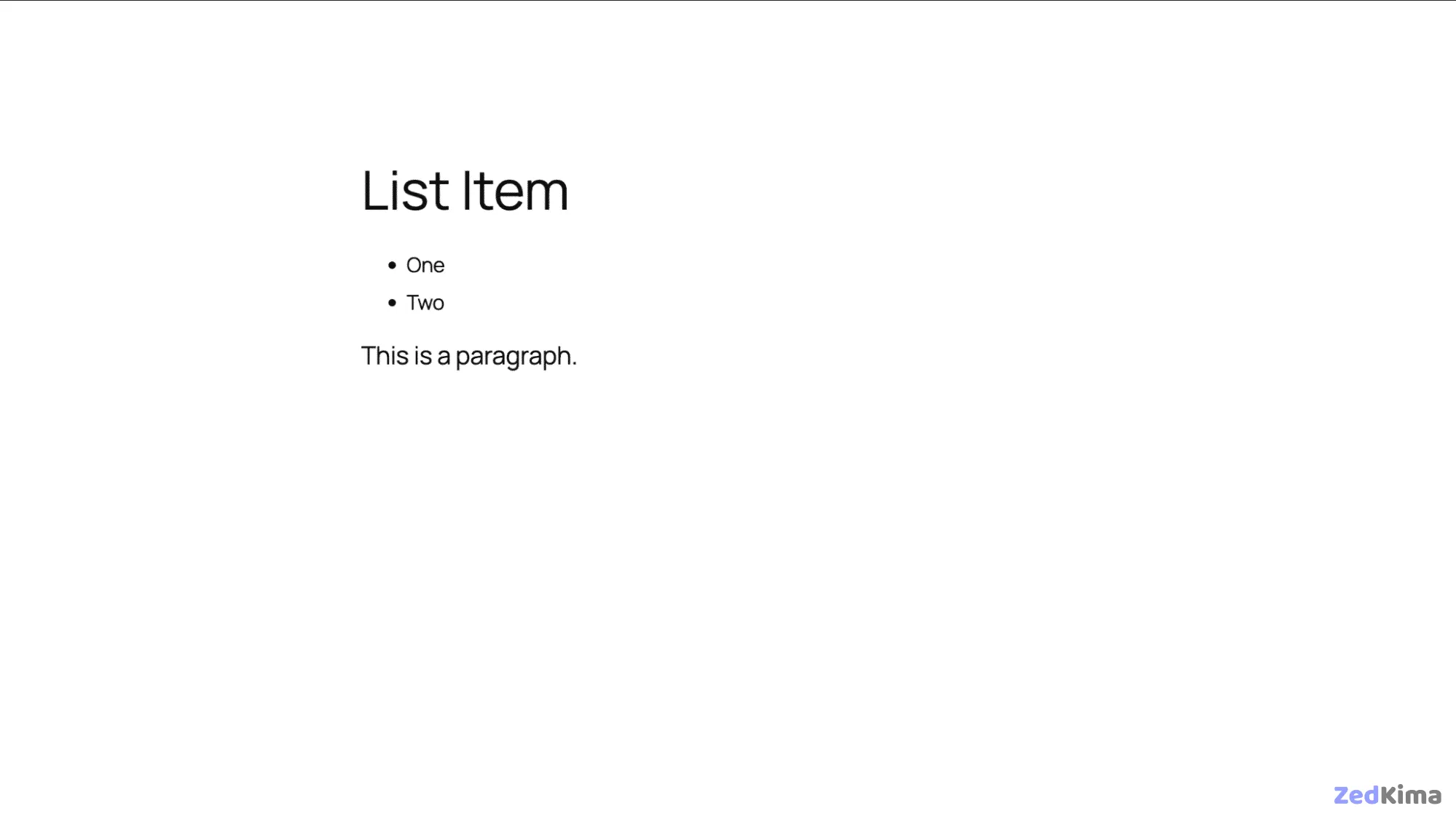
Custom fluid typeface for a single block
You can target fluid sizing to specific blocks when you need finer control.
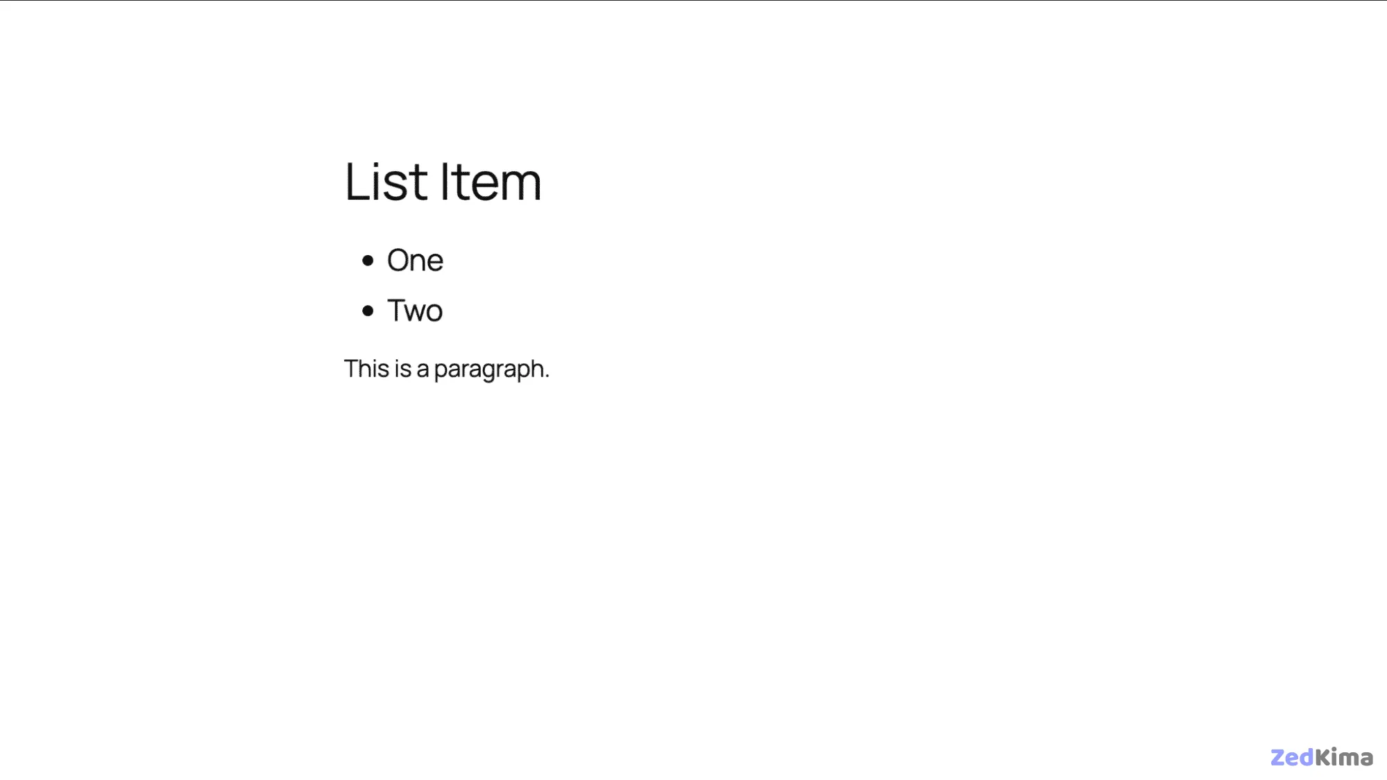
For example, to set list items (core/list) to use the medium size instead of the default large, add this to your theme.json:
"styles": {
  "blocks": {
    "core/list": {
      "typography": {
        "fontSize": "var:preset|font-size|medium"
      }
    }
  }
}
The result is a clearer hierarchy, with list items slightly smaller than paragraphs.
Setting fluid typography in style.css
If you’re working with a classic theme, define your own clamp() values directly in style.css.
For example, here’s how to make list items 125% of the large font size:
li {
  font-size: clamp(1.725rem, 1.725rem + 0.17vw, 1.71875rem) !important;
}
This sets a larger size for list items via your CSS. If you’re using a classic theme, you’ll write the clamp() rule in your style.css file.
Fluid spacing
Type is only one piece of the puzzle when you adopt fluid systems.
Padding, margins, and block gaps (spacing inside group blocks) can also scale smoothly using the same principles as fluid type.
TT5 defines space sizes with the following settings.
"spacing": {
  "defaultSpacingSizes": false,
  "spacingSizes": [
    { "name": "Tiny", "size": "10px", "slug": "20" },
    { "name": "X-Small", "size": "20px", "slug": "30" },
    { "name": "Small", "size": "30px", "slug": "40" },
    { "name": "Regular", "size": "clamp(30px, 5vw, 50px)", "slug": "50" },
    { "name": "Large", "size": "clamp(30px, 7vw, 70px)", "slug": "60" },
    { "name": "X-Large", "size": "clamp(50px, 7vw, 90px)", "slug": "70" },
    { "name": "XX-Large", "size": "clamp(70px, 10vw, 140px)", "slug": "80" }
  ]
}
The first three sizes (tiny, x-small, small) are fixed; the larger steps scale fluidly with clamp().
This way, both your typography and layout spacing adapt elegantly across screen sizes.
Choosing sensible min and max values
A reliable way to pick your min and max sizes is to anchor them to two concrete layouts you actually design for—your narrowest comfortable reading width and your widest content width. Set the minimum for your smallest body size at the narrow width, then choose a maximum that preserves readable line length at the wide width.
- Pick a viewport range you care about (for example, 360px to 1280px).
- Decide a base text size that reads well at 360px (for example, 16px or 1rem).
- Find the largest base size that still yields 60–75 characters per line at 1280px (often 18–20px).
- Use those two values as the ends of your clamp.
/* Example: clamp base body text between 1rem and 1.125rem */
:root {
  --fs-body: clamp(1rem, 0.95rem + 0.5vw, 1.125rem);
}
body { font-size: var(--fs-body); }
Tip: heading scales should grow faster than body text. A common approach is to use larger slopes (the “vw” portion) as you go up the hierarchy.
Deriving clamp() by hand (the quick math)
You can compute the middle term yourself if you want consistent logic across your scale.
- Choose your min and max viewport widths (e.g., 360px and 1280px).
- Choose min and max font sizes (e.g., 16px and 20px).
- Compute the slope:
(maxSize - minSize) / (maxVW - minVW). - Convert slope to
vw: multiply by 100 to get “per 100% width”. - Compute the intercept:
minSize - slope * minVW.
/* With minVW=360, maxVW=1280, minSize=16px, maxSize=20px */
:root {
  --fs-body: clamp(1rem, 0.875rem + 0.625vw, 1.25rem);
}
Don’t worry about being perfect—pick readable endpoints first, then iterate if the rate of growth feels too fast or slow.
Fluid line-height, measure, and rhythm
Scaling font-size is only half the story. You’ll get better results if line-height, line length (measure), and vertical spacing adapt too.
- Line-height: keep it slightly higher at small sizes and tighten a bit as sizes grow.
- Measure: aim for 60–75 characters per line for body text. The
chunit is perfect for this. - Rhythm: tie margins and gaps to a fluid space scale so blocks breathe consistently.
/* Fluid line-height that eases from 1.6 to 1.45 across the range */
:root {
  --lh-body: clamp(1.45, 1.3 + 0.5vw, 1.6);
}
p { line-height: var(--lh-body); }

/* Constrain readable measure */
p, li {
  max-inline-size: clamp(55ch, 50ch + 5vw, 75ch);
}

/* Fluid block spacing (vertical rhythm) */
:root {
  --space-1:  clamp(0.5rem, 0.4rem + 0.4vw, 0.75rem);
  --space-2:  clamp(0.75rem, 0.6rem + 0.8vw, 1.25rem);
  --space-3:  clamp(1rem, 0.8rem + 1.2vw, 2rem);
}
p + p { margin-block-start: var(--space-2); }
Component-level scaling with container queries
Viewport-based scaling is great, but sometimes a component lives in a narrow sidebar on a large screen. Container queries let type scale with the component’s own width rather than the whole viewport.
/* 1) Make a component a size container */
.card {
  container-type: inline-size; /* establishes a container */
  padding: var(--space-2);
}

/* 2) Scale heading inside the card by the card's width */
.card h3 {
  font-size: clamp(1rem, 0.9rem + 2cqw, 1.5rem); /* cqw = 1% of container width */
}

/* 3) Use @container for step adjustments if needed */
@container (min-width: 40rem) {
  .card h3 { letter-spacing: -0.005em; }
}
Use container-based scaling for cards, sidebars, and widgets; keep viewport-based scaling for document-level elements like body text and page titles.
WordPress: advanced theme.json tips
- Expose tokens as CSS variables: WordPress generates
--wp--preset--font-size--*variables for your presets. Reference them directly in custom CSS to keep everything in sync.
/* Use theme presets in custom CSS */
.entry-content { font-size: var(--wp--preset--font-size--medium); }
.entry-content h2 { font-size: var(--wp--preset--font-size--x-large); }- Per-block overrides: In
theme.json, use thestyles.blockssection to assign a different preset (or entirely custom clamp) to specific blocks without touching global defaults.
{
  "styles": {
    "blocks": {
      "core/heading": {
        "typography": {
          "fontSize": "var(--wp--preset--font-size--x-large)",
          "lineHeight": "clamp(1.15, 1.1 + 0.3vw, 1.3)"
        }
      }
    }
  }
}- Editor parity: After defining presets, confirm that the Site Editor’s Typography panel offers the same names and behavior; rely on presets so authors can pick sizes without custom CSS.
Accessibility guardrails
- Respect user scaling: Base sizes in
remso browser zoom and OS text-size preferences scale everything predictably. - Contrast and weight: If you reduce line-height at larger sizes, ensure color contrast and weight remain accessible. Avoid ultra-light weights for body copy.
- Motion and transitions: Avoid animating font-size; it can be disorienting. Prefer instant changes.
- Long words and wrapping: Prevent overflow in narrow layouts and languages with long compounds.
/* Wrapping and hyphenation helpers */
p, h1, h2, h3, h4 {
  overflow-wrap: anywhere;
  hyphens: auto;
}
Common pitfalls and how to fix them
- Over-aggressive growth: If headings balloon too fast, reduce the
vwportion of the clamp or lower the max size. - Cramped small screens: Increase the minimum size’s line-height and reduce letter-spacing slightly for headings to preserve clarity.
- Inconsistent spacing: Tie margins and gaps to a shared fluid space scale instead of hard-coded rem values.
- CLS from web fonts: Use
font-display: swapand considerfont-size-adjustto match fallback x-height and minimize layout shift.
@font-face {
  font-family: "Inter Var";
  src: url("/fonts/inter-var.woff2") format("woff2");
  font-display: swap;
  font-weight: 100 900;
  font-style: normal;
  font-size-adjust: 0.52; /* helps align fallback/loaded metrics */
}
A reusable fluid type scale with CSS variables
Define a small set of tokens and reuse them anywhere—classic or block themes.
:root {
  /* body base */
  --fs-0: clamp(1rem, 0.95rem + 0.5vw, 1.125rem);

  /* headings grow progressively faster */
  --fs-1: clamp(1.125rem, 1rem + 1vw, 1.375rem);
  --fs-2: clamp(1.375rem, 1.15rem + 1.6vw, 1.75rem);
  --fs-3: clamp(1.75rem, 1.4rem + 2.4vw, 2.5rem);
  --fs-4: clamp(2.25rem, 1.7rem + 3.4vw, 3.25rem);
}

body { font-size: var(--fs-0); }
h6 { font-size: var(--fs-1); line-height: 1.3; }
h5 { font-size: var(--fs-2); line-height: 1.25; }
h4 { font-size: var(--fs-2); line-height: 1.25; }
h3 { font-size: var(--fs-3); line-height: 1.2;  }
h2 { font-size: var(--fs-3); line-height: 1.15; }
h1 { font-size: var(--fs-4); line-height: 1.1;  }
Testing checklist
- Zoom to 200% and 400% and confirm the layout remains usable and readable.
- Resize the viewport from phone widths to large monitors; watch for awkward leaps or crowded lines.
- Toggle between system fonts and your web font to ensure line length still feels right with fallbacks.
- Check languages with longer words (e.g., German, Finnish) and CJK scripts; adjust measure and wrapping as needed.
- Review in the WordPress editor (list view + canvas) to ensure presets feel consistent for authors.
Migration playbook (from breakpoint steps to fluid)
- Inventory existing font sizes and where they change at breakpoints.
- Pick a min and max viewport and derive clamp values for your base and headings.
- Replace stepped media queries with clamp-based tokens; keep only a few targeted breakpoints for exceptions.
- Unify spacing with a small fluid space scale to stabilize rhythm.
- Validate accessibility at common zoom levels; ship, then iterate on the slope if growth feels off.
Summary
Breakpoint-based and fluid typography serve different roles. Used together, they produce resilient layouts that scale smoothly and deliver consistent, readable experiences for everyone.
If you’d rather not calculate values by hand, these free tools make it easy to fine-tune and preview your scale:
These helpers generate clamp() values that match your design system—especially handy when you’re working with classic themes.
Ready to try it in production? Choose a performant WordPress host with fast TTFB, a global CDN, and edge caching so your fluid type renders quickly and consistently everywhere.