
The Gutenberg editor has matured into a versatile, highly adaptable tool for website creation. Besides its extensive default capabilities, WordPress gives developers a robust set of APIs, making it possible to create genuinely personalized editing experiences.
This guide explores two often-overlooked, yet incredibly practical WordPress development features: Style Variations (often called block styles) and Block Variations.
Even if they seem niche at first glance, you’ll discover how valuable—and surprisingly simple—they are to integrate into your everyday workflow.
We’ll break down exactly what these features do and walk you through a real-world project. You can try this project on your own WordPress installation with just a simple copy-paste of the code from this tutorial, then make adjustments as needed.
Let’s quickly cover the prerequisites before we jump in:
- Local WordPress development environment: You can use any development setup you prefer. Local tools help you work safely and efficiently when building and testing plugins.
- Node.js and npm: Since the block editor is built on React, a build process powered by Node.js is required.
- Basic frontend development skills: Understanding Node.js, JavaScript (with React), PHP, and CSS will be helpful.
This isn’t a high-difficulty project, but some hands-on coding will be involved.
Let’s get started!
Table of Contents
Block styles Vs. Block variations
Block Styles and Block Variations are both powerful assets for WordPress developers. While their names are similar, their use cases and applications differ.
Block Styles (also referred to as style variations) provide a set of preset CSS options, letting users change the look of a block with a single click. Once you add a block style, users will see a button in the block sidebar to instantly apply that preset styling. Styles can be toggled and previewed live in the editor.
Style variations only impact presentation—they don’t touch the block’s data or attributes. They simply apply a CSS class to the block’s wrapper.
Block variations, by comparison, offer more flexibility. They let you craft a preconfigured version of a block—complete with default settings, attributes, and even inner blocks. Variations show up as separate options in the block inserter. To users, they appear as fully standalone blocks, separate from their base block.
Block variations enable significant customization: including appearance, default configuration, and structure.
With these distinctions in mind, let’s see how these features empower you to elevate your Gutenberg blocks!
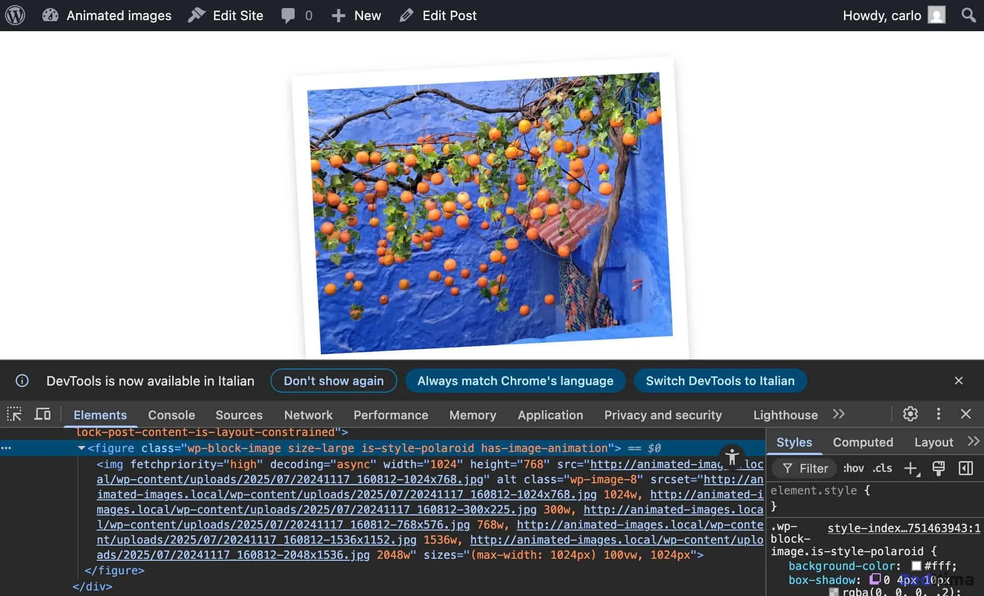
An animated Polaroid effect on a core Image block
Now, let’s put this into practice. We’ll enhance the core Image block with a custom Gutenberg plugin to achieve three things:
- Add a Polaroid Style Variation: Let users apply a classic Polaroid photo effect to images with one click in the sidebar.
- Introduce a Hover Animation: Make Polaroid-style images come alive with a subtle hover animation.
- Register an “Animated Polaroid” Block Variation: This lets users quickly drop in a pre-configured Polaroid image with animation from the block inserter.
Ready to dive in? Let’s set up the plugin framework.

Environment setup
Before we proceed, make sure you’ve set up a WordPress local development site and installed Node.js and npm. If you’d like extra help, check out a tutorial on building Gutenberg plugins to expand the block editor.
Step 1 – Create the basic plugin structure
We’ll call this plugin Image Hacker.
Go to your plugins directory, and make a new folder called image-hacker. Inside, create a main file called image-hacker.php and add a src subdirectory. You’ll place your plugin’s code here.
Your plugin structure should look like this:
/wp-content/plugins/
└── /image-hacker/
	├── image-hacker.php
	└── /src/
Step 2 – Create the PHP code
Next, ensure WordPress can recognize and interact with your plugin. In image-hacker.php, enter this code:
<?php
/**
 * Plugin Name: Image Hacker
 * Description: Adds an animation effect to the core Image block
 * Version:     1.0.0
 * Author:      Your Name
 * License:     GPL-2.0-or-later
 * License URI: https://www.gnu.org/licenses/gpl-2.0.html
 * Text Domain: image-hacker
 */

if ( ! defined( 'ABSPATH' ) ) {
	exit; // Exit if accessed directly.
}
Step 3 – Install dependencies
Open a terminal, navigate to your plugin’s folder, and run this command to initialize your package.json with all needed dependencies and scripts:
npm init -yThis sets up your project structure.
Then, add WordPress scripts and build tools such as webpack and Babel:
npm install @wordpress/plugins @wordpress/scripts --save-devOnce these install, you’ll see a node_modules folder and a package-lock.json file. Here’s how your plugin should appear in Visual Studio Code:
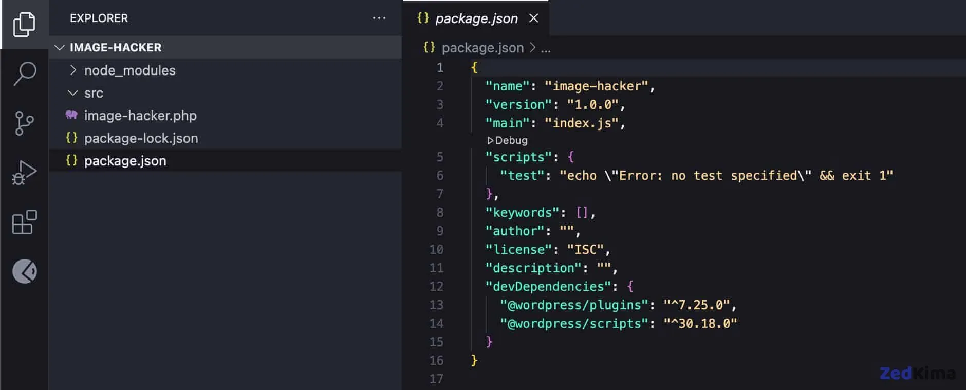
Open your package.json file and edit the scripts section as needed:
{
	"name": "image-hacker",
	"version": "1.0.0",
	"main": "index.js",
	"scripts": {
		"build": "wp-scripts build",
		"start": "wp-scripts start"
	},
	"keywords": [],
	"author": "",
	"license": "ISC",
	"description": "",
	"devDependencies": {
		"@wordpress/plugins": "^7.25.0",
		"@wordpress/scripts": "^30.18.0"
	}
}
Your actual devDependencies versions may be up-to-date or differ depending on your local environment.
Step 4 – Create your plugin’s source files
In the src folder, add these files:
index.jsstyle.scsseditor.scss
Your structure should resemble:
/wp-content/plugins/
└── /image-hacker/
	├── /node-modules/
	├── image-hacker.php
	├── package.json
	├── package-lock.json
	└── /src/
		├── index.js
		├── style.scss
		└── editor.scss
Now, in the WordPress admin, visit the Plugins section and activate Image Hacker.
Step 5 – Enqueue assets in your plugin’s file
It’s time to ensure the necessary assets are included. Add the following to image-hacker.php:
/**
 * Enqueue block editor assets.
 */
function image_hacker_enqueue_editor_assets() {
	$asset_file = include( plugin_dir_path( __FILE__ ) . 'build/index.asset.php');

	// Enqueue the script with our modifications
	wp_enqueue_script(
		'image-hacker-script',
		plugins_url( 'build/index.js', __FILE__ ),
		array( 'wp-plugins', 'wp-edit-post' ),
		filemtime( plugin_dir_path( __FILE__ ) . 'build/index.js' )
	);

	// Enqueue the editor-only styles
	wp_enqueue_style(
		'image-hacker-editor-style',
		plugins_url( 'build/editor.css', __FILE__ ),
		[],
		filemtime( plugin_dir_path( __FILE__ ) . 'build/editor.css' )
	);
}
add_action( 'enqueue_block_editor_assets', 'image_hacker_enqueue_editor_assets' );

/**
 * Enqueue frontend and editor assets.
 */
function image_hacker_enqueue_assets() {
	$asset_file = include( plugin_dir_path( __FILE__ ) . 'build/index.asset.php');

	// Enqueue styles for both frontend and editor
	wp_enqueue_style(
		'image-hacker-style',
		plugins_url( 'build/style-index.css', __FILE__ ),
		[],
		filemtime( plugin_dir_path( __FILE__ ) . 'build/style-index.css' )
	);
}
add_action( 'enqueue_block_assets', 'image_hacker_enqueue_assets' );
This code does the following:
- The
enqueue_block_editor_assetsaction registers yourindex.jsJavaScript andeditor.cssstyles for the block editor. - The
enqueue_block_assetsaction includes yourstyle.csson the frontend and the editor.
Remember, these reference assets in your plugin’s /build/ directory. You’ll need to compile them by running this build command in your terminal: Also take a look at this related read → How to Enqueue Your Assets in WordPress
npm run buildAlso, when you import style.scss from index.js, the resulting CSS may be named style-index.css rather than just style.css.
Register block style
Your development environment is now in place. Now, let’s move on to registering a custom block style variation.
There are different approaches for registering block styles, including PHP and JS. For this Gutenberg plugin, we’ll use JavaScript. Open /src/index.js and paste:
// Import the function to register block styles.
import { registerBlockStyle } from '@wordpress/blocks';

// Import the function to run code only when the DOM is ready.
import domReady from '@wordpress/dom-ready';

// This line tells the build process to include and compile our SCSS file.
import './style.scss';

/**
 * Use domReady to run code only when the DOM is ready.
 */
domReady(() => {
	// Register our new style variation for the core image block.
	registerBlockStyle('core/image', {
		name: 'polaroid',
		label: 'Polaroid',
	});
});
The registerBlockStyle function, wrapped in domReady, ensures that your style is registered once the DOM is fully loaded. For reference, see the official documentation and block style API.
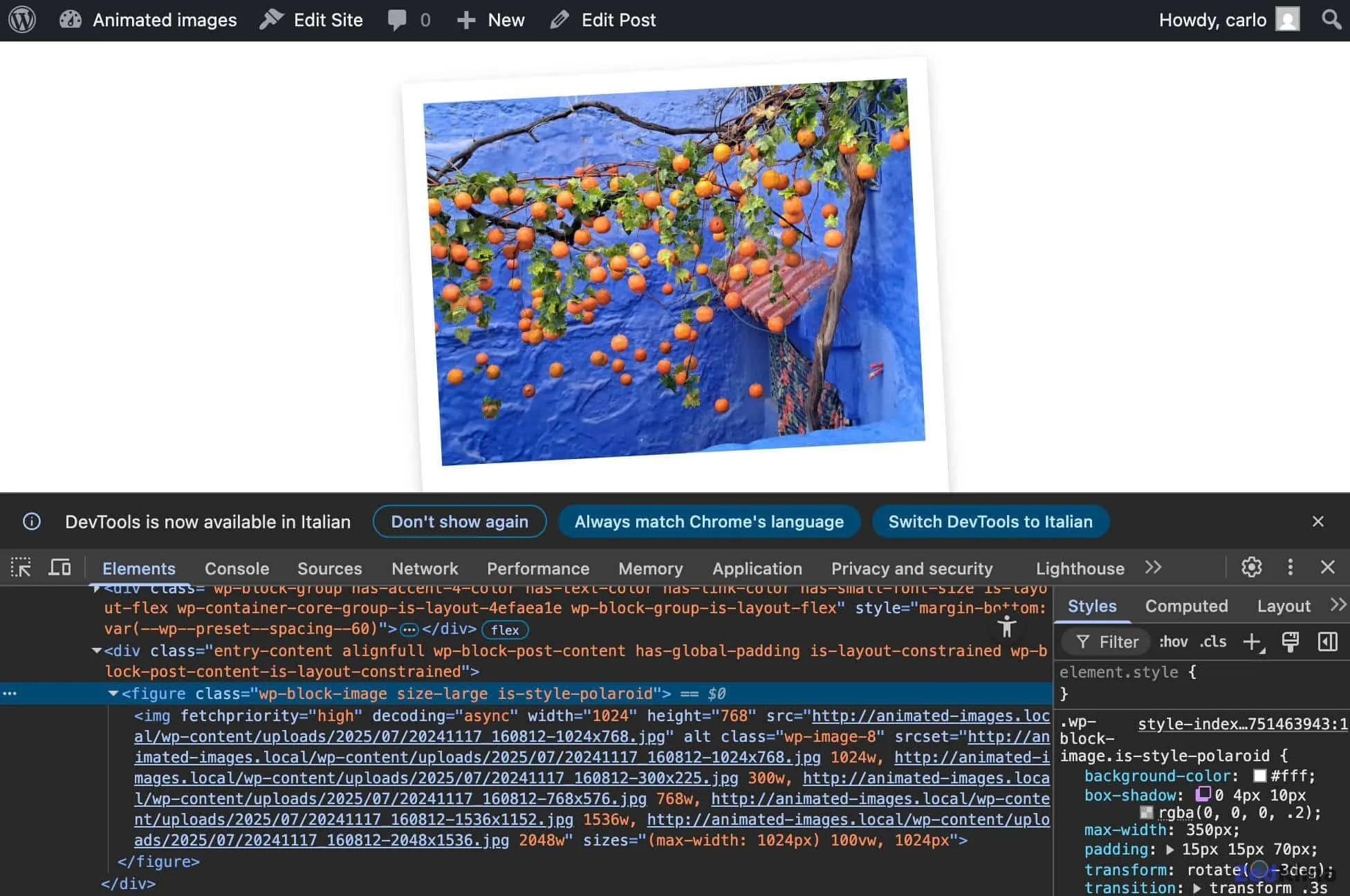
When the Polaroid style is selected, WordPress adds the .is-style-polaroid CSS class to the Image block wrapper.
Now, provide the CSS for this style. In /src/style.scss, add:
.wp-block-image.is-style-polaroid {
padding: 15px 15px 70px 15px;
background-color: white;
box-shadow: 0 4px 10px rgba(0, 0, 0, 0.2);
max-width: 360px;
transform: rotate(-3deg);
transition: transform 0.3s ease-in-out;
figure {
margin: 0 !important;
}
img {
display: block;
width: 100%;
height: auto;
}
figcaption {
position: absolute;
bottom: 15px;
left: 0;
right: 0;
text-align: center;
font-family: 'Permanent Marker', cursive;
color: #333;
font-size: 18px;
}
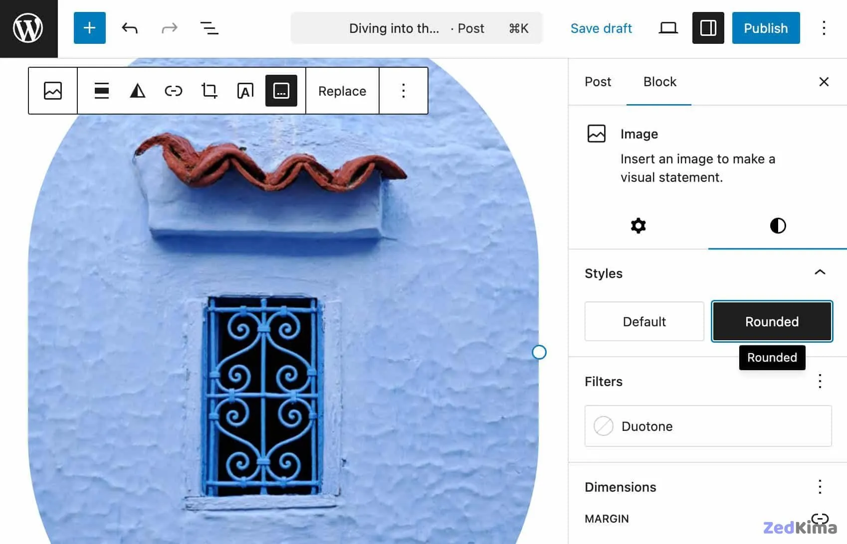
}Save, run npm run build, then open your WordPress dashboard. Add a new post or page, insert an image, select it, and choose the Polaroid style from the block’s Styles sidebar.
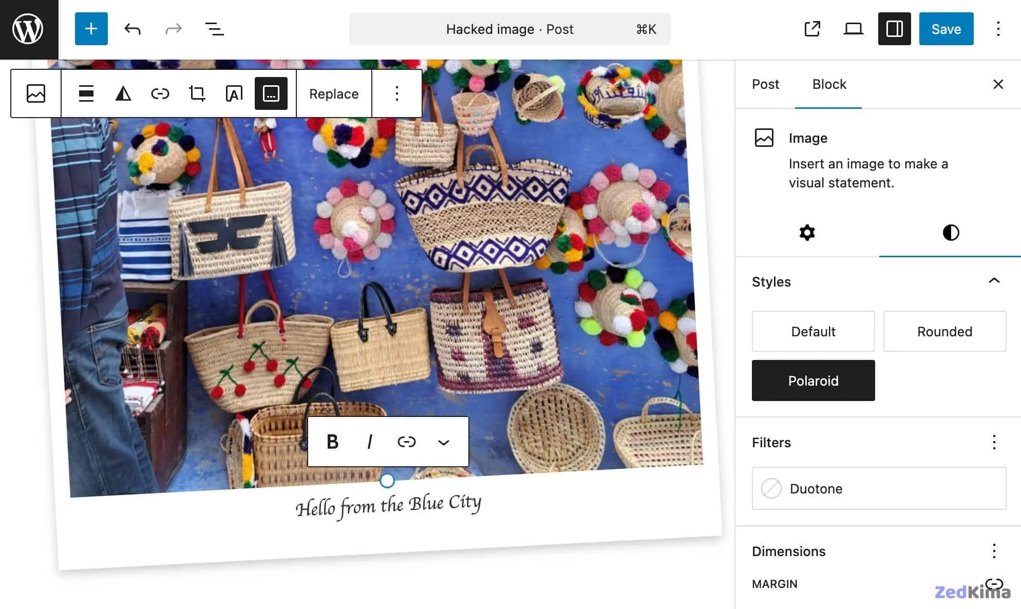
Add a caption and preview your post. You should see a Polaroid-themed image with an italic caption styled appropriately.
Build the logic
Next, let’s introduce animation—having the image gently rotate or lift when hovered. Add the following to src/style.scss to define the animated effect:
.wp-block-image.is-style-polaroid.has-image-animation:hover {
	transform: rotate(0deg) scale(1.05);
}
This code applies the hover animation only if the image is a Polaroid, and the has-image-animation class is set by the toolbar toggle.
To apply this CSS class to the correct element, you’ll use a combination of filters and callback functions.
First, add this line to src/index.js:
import { addFilter } from '@wordpress/hooks';Step 1. Add a new attribute to the Image block
You’ll use addFilter to add an imageAnimation attribute to the Image block:
function addImageAnimationAttribute( settings, name ) {
	if ( name !== 'core/image' ) {
		return settings;
	}
	settings.attributes = {
		...settings.attributes,
		imageAnimation: {
			type: 'boolean',
			default: false,
		},
	};
	return settings;
}

addFilter(
	'blocks.registerBlockType',
	'image-hacker/add-image-animation-attribute',
	addImageAnimationAttribute
);
The callback addImageAnimationAttribute works like this:
settings: The current block settingsname: The block type being filtered
The function returns the modified attributes, adding support for image animation.
Step 2. Add a toggle control to the Image block
You’ll now add a toggle button to the Image block’s toolbar so users can enable animation.
Start by importing the necessary components in index.js:
import { createHigherOrderComponent } from '@wordpress/compose';
import { Fragment } from '@wordpress/element';
import { BlockControls } from '@wordpress/block-editor';
import { ToolbarGroup, ToolbarButton } from '@wordpress/components';
import { __ } from '@wordpress/i18n';
Then, append this code to the end of your file:
const withPolaroidControls = createHigherOrderComponent((BlockEdit) => {
	return (props) => {
		if (props.name !== 'core/image') {
			return <BlockEdit {...props} />;
		}

		const { attributes, setAttributes, isSelected } = props;
		const { imageAnimation, className, lightbox } = attributes;

		return (
			<Fragment>
				<BlockEdit {...props} />

				<BlockControls>
					<ToolbarGroup>
						<ToolbarButton
							icon="format-image"
							label={__('Toggle Animation', 'image-hacker')}
							isActive={imageAnimation}
							onClick={() =>
								setAttributes({ imageAnimation: !imageAnimation })
							}
						/>
					</ToolbarGroup>
				</BlockControls>
			</Fragment>
		);
	};
}, 'withPolaroidControls');

addFilter(
	'editor.BlockEdit',
	'image-hacker/with-polaroid-controls',
	withPolaroidControls
);
What happens here:
createHigherOrderComponentwrapsBlockEdit, letting you extend the block’s editing UI.- The wrapper checks if the block is an Image block before adding controls.
- Using destructuring, it pulls out required props and state.
BlockControls,ToolbarGroup, andToolbarButtonbuild the Toggle Animation button in the block toolbar.isActivereflects the current animation state.onClicktoggles animation on or off.
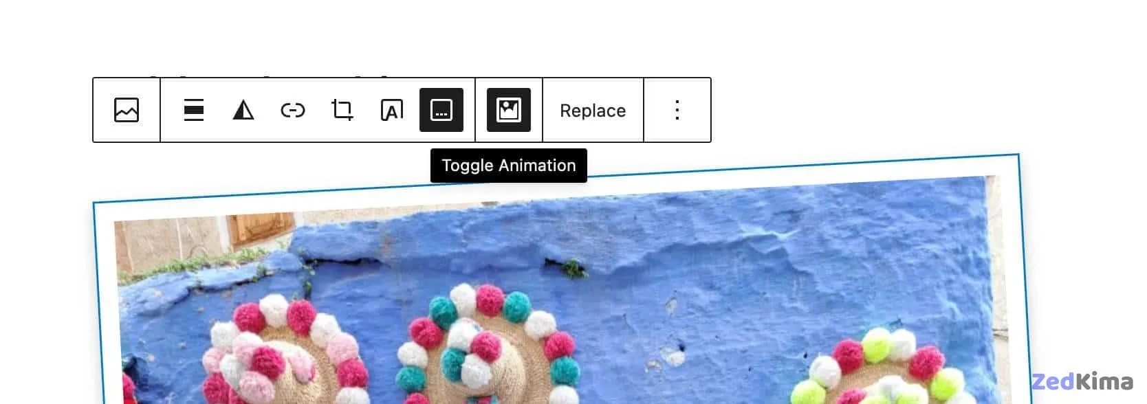
You now have both an attribute and a control button, although the effect isn’t active yet.
Step 3. Add the CSS class to the wrapper element
The final piece is to add has-image-animation to the figure when appropriate. This filter ensures the right class is set in the rendered HTML.
Append the following code to index.js:
function addAnimationFrontendClass(extraProps, blockType, attributes) {
	if (blockType.name === 'core/image' && attributes.imageAnimation) {
		extraProps.className = `${extraProps.className || ''} has-image-animation`;
	}
	return extraProps;
}

addFilter(
	'blocks.getSaveContent.extraProps',
	'image-hacker/add-animation-frontend-class',
	addAnimationFrontendClass
);
This dynamically attaches has-image-animation to the figure wrapper when animation is enabled.
Here’s a quick rundown:
addFilterallows you to modify block data or markup with callbacks.blocks.getSaveContent.extraPropsis the specific editor hook for adding extra wrapper properties.image-hacker/add-animation-classnames your filter uniquely.addAnimationFrontendClassexecutes for every block render, receiving:extraProps: Current wrapper properties, includingclassNameblockType: Block details, includingnameattributes: Block attributes
- If the block is an Image and animation is active, the CSS class is appended.
Test it out—add an image, choose Polaroid style in the sidebar, then toggle the animation button. Save and preview your post. The image will now rotate when hovered.
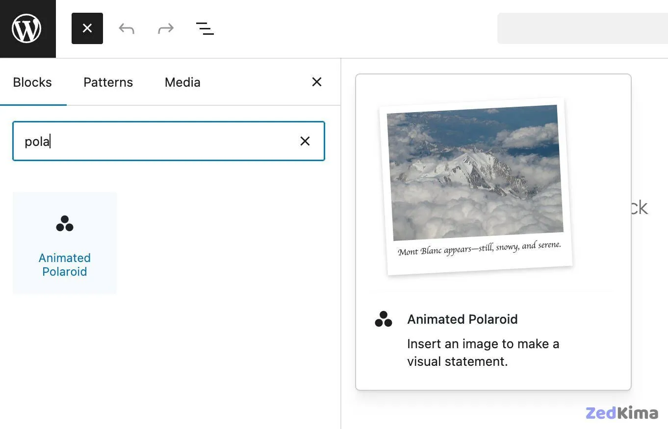
Register block variation
Block variations let you predefine a version of an existing block, complete with initial settings and, if desired, child blocks. Gutenberg presents these as selectable blocks in the inserter, each with its own icon.
Let’s make a new Image block variation that defaults to the Polaroid style and includes animation.
Start by importing registerBlockVariation in src/index.js:
import { registerBlockStyle, registerBlockVariation } from '@wordpress/blocks';Next, add a call to registerBlockVariation within domReady(), just after registerBlockStyle:
domReady(() => {
	// Register a style variation for the image block.
	registerBlockStyle('core/image', {
		name: 'polaroid',
		label: 'Polaroid',
	});

	// Register a block variation of the image block
	registerBlockVariation('core/image', {
		name: 'animated-polaroid',
		title: 'Animated Polaroid',
		icon: 'image-filter',
		attributes: {
			className: 'is-style-polaroid',
			imageAnimation: true,
		},
		scope: ['inserter'],
	});
});
This call registers the block variation. For more, see the block variations introduction and API documentation.
Save, build, and reload your WordPress admin. Try adding a new post and search for the Animated Polaroid block—your new custom variation will be there!
Testing and debugging
Let’s run some tests—add a few images, apply Polaroid styles, enable animation, and insert links. Don’t forget to try the Gallery block as well.
Most features should work smoothly. However, using a lightbox effect (the Enlarge on click option) alongside the Polaroid animation can create display issues.
This seems to stem from a conflict between WordPress’s lightbox and your CSS transitions.
To keep things simple—and user-friendly—consider disabling the Enlarge on click feature when the Polaroid style is active, and notify users of the change.
You’ll need some extra imports for this. Here’s the list added to src/index.js:
import { registerBlockStyle, registerBlockVariation } from '@wordpress/blocks';
import domReady from '@wordpress/dom-ready';
import { addFilter } from '@wordpress/hooks';
import { createHigherOrderComponent } from '@wordpress/compose';
import { Fragment, useEffect } from '@wordpress/element';
import { InspectorControls, BlockControls } from '@wordpress/block-editor';
import { PanelBody, Notice, ToolbarGroup, ToolbarButton } from '@wordpress/components';
import { __ } from '@wordpress/i18n';
import { useDispatch } from '@wordpress/data';
import './style.scss';
The new imports include:
useEffectfrom@wordpress/element, following official docs.InspectorControlsfrom@wordpress/block-editor(see docs).PanelBodyandNoticefrom@wordpress/components(reference).useDispatchfrom@wordpress/data(WordPress Developer Blog).
Now, update the withPolaroidControls function as follows:
const withPolaroidControls = createHigherOrderComponent((BlockEdit) => {
	return (props) => {
		if (props.name !== 'core/image') {
			return <BlockEdit {...props} />;
		}

		const { attributes, setAttributes, isSelected } = props;
		const { imageAnimation, className, lightbox } = attributes;

		const isPolaroid = className?.includes('is-style-polaroid');

		const { createNotice } = useDispatch('core/notices');

		useEffect(() => {
			if (isPolaroid && lightbox?.enabled) {
				// Disable the lightbox to prevent the conflict.
				setAttributes({ lightbox: { ...lightbox, enabled: false } });

				// Show the user a temporary 'snackbar' notice.
				createNotice(
					'warning', // The type of notice (info, success, warning, error)
					__('Lightbox disabled for Polaroid style.', 'image-hacker'),
					{
						type: 'snackbar',
						isDismissible: true,
					}
				);
			}
		}, [isPolaroid, lightbox]);

		return (
			<Fragment>
				<BlockEdit {...props} />

				<BlockControls>
					<ToolbarGroup>
						<ToolbarButton
							icon="format-image"
							label={__('Toggle Animation', 'image-hacker')}
							isActive={imageAnimation}
							onClick={() =>
								setAttributes({ imageAnimation: !imageAnimation })
							}
						/>
					</ToolbarGroup>
				</BlockControls>

				{isSelected && isPolaroid && (
					<InspectorControls>
						<PanelBody title={__('Polaroid Style', 'image-hacker')}>
							<Notice status="info" isDismissible={false}>
								{__(
									'The "Expand on click" (lightbox) feature is disabled for this style to prevent visual conflicts.',
									'image-hacker'
								)}
							</Notice>
						</PanelBody>
					</InspectorControls>
				)}
			</Fragment>
		);
	};
}, 'withPolaroidControls');useEffectlets you sync the component with the lightbox state and Polaroid status, running code as either value changes (see React docs).- The check
if (isPolaroid() && lightbox.enabled)disables the lightbox if the Polaroid effect is active. - This action triggers a brief warning for the user using the Notices API (see reference).
- A persistent warning panel appears in the block toolbar as long as Polaroid and lightbox are both toggled.

Expanding on Block Styles and Block Variations
To further clarify the distinction between block styles and block variations, consider some real-world use cases and best practices:
- Block Styles Example: Suppose you have a Quote block used throughout a client’s site. By offering custom styles for “Testimonial”, “Pull Quote”, or “Classic” via block styles, editors can switch between these looks without altering the quote content or structure.
- Block Variations Example: Imagine you need a “Callout Box” block on several pages. Instead of building a block from scratch, you can create a variation of the core Paragraph block with pre-filled text, color, and an icon, so users can select “Callout” in the editor and get started instantly.
When planning your editor customizations, remember:
- Use block styles for simple look changes where the underlying data stays the same.
- Use block variations when you need different default settings, attributes, icons, or inner blocks for a commonly-used pattern.
Additional Use Cases and Ideas
The techniques from this guide are adaptable to other blocks and workflows, for example:
- Applying multiple brand-specific color schemes to Buttons via style variations.
- Creating a “Feature List” block variation based on the core List block, pre-configured with checkmark icons and bold headings.
- Offering pre-designed hero images or banners as block variations, which include grouped image and Heading blocks, ready for instant use.
Best Practices for Custom Block Styles and Variations
- Namespacing: Prefix your style and variation names to avoid collision with core styles or those from other plugins. For example,
namespace-polaroidinstead of justpolaroid. - Accessibility: When creating visually distinctive styles, ensure color contrast is sufficient, and animations don’t impede readability or accessibility for users with motion sensitivity.
- Documentation: Consider adding a
README.mdin your plugin folder with screenshots and usage notes, especially if you’re handing the plugin off to clients or teammates. - Editor Experience: Test your styles and variations in both the default and full-site editing contexts to ensure consistency.
Troubleshooting Tips
- If a style or variation doesn’t appear after registration, try clearing your browser cache and ensure you’re running
npm run buildevery time you change your source files. Also don’t miss this related post → Unregistering style variations in a WordPress block theme - Double-check the block name as used in
registerBlockStyleandregisterBlockVariation. For example, the core Image block is registered as'core/image'. - Use the browser inspector or WordPress’s built-in InspectorControls to reveal block attributes, which helps with debugging filters and custom attributes.
Performance and Compatibility Considerations
- Loading CSS Efficiently: Include only the minimum CSS required for your custom style. Too many global rules can cause CSS bloat and slow down your pages.
- Maintaining Future Compatibility: Use official WordPress APIs and avoid overwriting core JavaScript or CSS whenever possible, as core blocks can evolve between updates. Always check the Block Editor Handbook for the latest APIs and patterns.
Expanding Further: Advanced Use of Block Variations
Block variations aren’t limited to simple presets. You can:
- Bundle Groups of Blocks: Register a variation of the
core/groupblock that comes pre-filled with Heading, Image, and Button blocks configured to work together for a “Call to Action” section. - Offer Localized Variations: When building for multilingual sites, register variations with localized placeholder text for each language, integrating with plugins like WPML or Polylang.
- Dynamic Icons and Descriptions: Include custom SVG icons and contextual descriptions for each variation to make the block inserter more user-friendly for non-technical editors.
Summary
In this guide, you explored core WordPress block editor developer capabilities via a hands-on example—adding unique styles and animated effects to the core Image block that aren’t available by default.
We started with a style variation for the Image block, giving users a fast way to apply a Polaroid look. Then we built a toolbar control to add a fun hover animation. Finally, we tied it together with a preconfigured block variation that makes it easy to add animated Polaroid images to any page.
With these practical tools in your toolbox, you’re ready to create even more creative and custom experiences for WordPress block editor users.
Happy coding!